Have you been so preoccupied with following through on your personal new year’s resolutions that there hasn’t been much time for anything else? When trying to balance work, family, relationships and our own interests, it’s easy to see how making changes to our home’s design can be overlooked. If, however, you want to make some changes and are unsure where to begin, let this guide to the 2013 colors of the year get you started in the right direction.
Background of Colors of the Year
So, where does the idea of “color of the year” come from? And, perhaps more importantly, why should you care? While the Color of the Year list isn’t government-sanctioned or anything along those lines, the company that originated the concept has been an authority in the industry for quite some time and has the ultimate credibility when it comes to color.
That organization, of course, is none other than Pantone. For over 50 years, Pantone has been the standard in establishing colors for use in industries ranging from graphic and interior design to fashion and more.
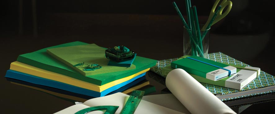
For over a decade Pantone has been predicting, and with much success (and influence), the color of the year. For 2013, Pantone has selected: Emerald.
Pantone Color of the Year: Emerald

Emerald brings up thoughts of royalty and beauty, which may have played a role in Pantone selecting it as their color of the year. Many cultures feel that green represents unity and healing, which is something it wouldn’t hurt to have more of in the world.
For centuries, we have been conditioned to view the color emerald to be as luxurious as the gemstone it is named after. Therefore, this rich green color will infuse your home with lush and magnificent sensations.
Try incorporating emerald into foyers and powder rooms. If you’re not looking to make that large of a commitment, dabble with emerald bedding, dinnerware and other accessories.
Sherwin-Williams Color of the Year: Aloe

Recognizing the popularity that comes with predicting trends in colors and styles, other companies known for color like paint company Sherwin-Williams started making predictions of their own.
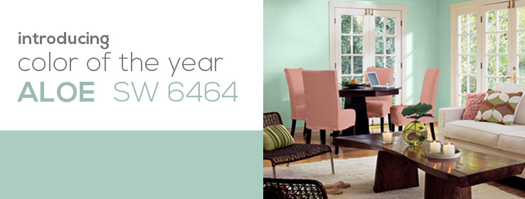
Sherwin-Williams’ 2013 Color of the Year is Aloe. Oddly enough, their aloe in no way resembles the green leaves of the Aloe Vera plant for which it was named. However, this smooth blue paint color has the same soothing effects as those the plant are famous for. Although this is technically a “cool” color, aloe serves as the perfect backdrop to display furniture and accents draped in warm colors. Aloe is ideal for giving bathrooms a spa-like feel or for decorating an airy sun room.
Benjamin Moore Color of the Year: Lemon Sorbet

Too good of a trend to pass up, paint company Benjamin Moore also makes trendy color predictions. Their Color of the Year pick for 2013 is Lemon Sorbet.
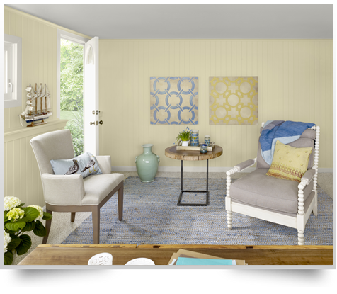
This light pastel can be very effective in warming up a room and making the space feel much larger and more open than it really is. Lemon Sorbet (the paint color, anyway) pairs well other pastels and neutral colors alike.
Not only do warm colors have the ability to open up a space, but they can also lift moods. lemon Sorbet will be a good selection for a country kitchen, a newborn’s nursery or a laundry room. While there are obvious exceptions (and you should feel free to experiment with them), soft colors like Lemon Sorbet are a natural fit for traditionally-designed homes.
—
So, don’t be selfish when it comes to makeovers and updating things in your life. Spread some of the love around and give your rooms a new look and feel also. Not sure where to start? Give these colors of the year some consideration. Mix it up. Start with a couple of rooms and spaces and you’ll see that updating your home can actually be quite addictive.
