Some of the world’s most beautiful things are the simplest. Sure, extravagance is great every now and then, but the simple things are what we cherish.
The funny thing about life is, those “simple things” are often harder than they look. Mom’s favorite recipe. Putting a piece of furniture together. They’re tougher than they appear to be.
Well, the same goes for decorating with two tones. Executing it correctly is what separates drab and boring from striking and dramatic.
When working with muted tones, it is vital to incorporate a variety of patterns and textures into the space. This will add depth to a room that would otherwise seem appear two-dimensional.
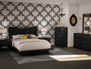
Consider the bedroom pictured here. The room is lively because of the mix of patterns, textures and shapes. The damask pattern serving as a wallpaper draws attention to that side of the room, which is where the central furnishings are.
Mixing the heavily textured and ornate black Baroque-period mirror and white smooth contemporary table lamps provide a subtle sense of balance. The straight lines provided by the modern furnishings ensure that the textural elements in this bedroom aren’t overdone.
This attention to detail is what’s necessary to execute designing a room with limited, muted tones.
